MPAChart深入浅出
引言
最近一个项目要弄图表,以前就知道MPAChart,却没有上手过。这次仔细了解了一番,发现这货居然分为收费版和免费版。[○・`Д´・ ○],没办法只能研究免费版,也发现存在一些不便和问题。
集成
官方文档上直接抄过来:
第一步,project的build.gradle文件中加入如下代码:1
2
3
4
5allprojects {
repositories {
maven { url "https://jitpack.io" }
}
}
第二步,module的build.gradle文件中加入如下代码:1
2
3dependencies {
implementation 'com.github.PhilJay:MPAndroidChart:v3.0.3'
}
相信大家都会的!!!

上手
讲真这个东西用起来不是很方便啊,控件没提供多少xml属性,布局如下:1
2
3
4
5
6<com.github.mikephil.charting.charts.BarChart
android:layout_marginTop="10dp"
android:id="@+id/bc_oee"
android:layout_width="match_parent"
android:layout_height="match_parent">
</com.github.mikephil.charting.charts.BarChart>
获取View然后进行一些初始化(样例取自项目中的代码,主要为了描述基本步骤):1
2
3
4
5
6
7
8
9
10private void initOEEChart(){
barEntries = new ArrayList<>(); //数据源
mBCOEE.setFitBars(true); //高度自适应
mBCOEE.setTouchEnabled(false); //不可触摸
initDescription();
initXAxis();
initYAxis();
initLegend();
mBCOEE.setNoDataText("暂无数据"); //没数据是提示
}
初始化描述图表描述:1
2
3
4private void initDescription(){
Description description = mBCOEE.getDescription();
description.setText("");
}
初始化X轴、Y轴:1
2
3
4
5
6
7
8
9
10
11
12
13
14
15
16
17
18
19
20
21
22
23
24
25
26
27
28
29
30
31
32
33
34
35private void initXAxis(){
XAxis xAxis = mBCOEE.getXAxis();
xAxis.setPosition(XAxis.XAxisPosition.BOTTOM);//设置x轴显示在底部,默认在顶部
xAxis.setGranularity(1f);//设置步长
xAxis.setAxisMinimum(0f);
xAxis.setValueFormatter(new IAxisValueFormatter() {
public String getFormattedValue(float value, AxisBase axis) {
if(value == 1f){
return "OEE";
}
if(value == 2f){
return "QE";
}
if(value == 3f){
return "PE";
}
if(value == 4f){
return "AE";
}
return "";
}
});
}
private void initYAxis(){
YAxis leftAxis = mBCOEE.getAxisLeft();
YAxis rightAxis = mBCOEE.getAxisRight();
leftAxis.setAxisMinimum(0f);
leftAxis.setAxisMaximum(100f);
leftAxis.setGranularity(5f);
rightAxis.setEnabled(false); //默认是有两个Y轴,即左右两边,这里让右边不展示
}
初始化图例:1
2
3
4
5
6
7
8
9
10
11private void initLegend(){
Legend legend = mBCOEE.getLegend();
legend.setVerticalAlignment(Legend.LegendVerticalAlignment.BOTTOM); //显示在底部,显示在左侧的时候会有延迟显示的问题,要达到像支付宝资产那样的图例,有问题
legend.setHorizontalAlignment(Legend.LegendHorizontalAlignment.CENTER);//水平居中
legend.setOrientation(Legend.LegendOrientation.HORIZONTAL);
legend.setDrawInside(false);
LegendEntry legendEntry = new LegendEntry();
legendEntry.label = "得分";
legendEntry.formColor = ContextCompat.getColor(getActivity(),R.color.oee_color);
legend.setCustom(new LegendEntry[]{legendEntry});//使用自定义的图例,默认会根据数据自动生成
}
最后就是动态绑定数据,如果数据是静态的,在初始化的时候直接设置进去,也是可以的 :1
2
3
4
5
6
7
8
9
10
11
12
13
14
15private void showOEE(OEE oee){
barEntries.clear();
if(oee != null){
barEntries.add(new BarEntry(1,oee.getOee()));
barEntries.add(new BarEntry(2,oee.getQe()));
barEntries.add(new BarEntry(3,oee.getPe()));
barEntries.add(new BarEntry(4,oee.getAe()));
}
barDataSet = new BarDataSet(barEntries,"");
barDataSet.setColors(ContextCompat.getColor(getActivity(),R.color.oee_color));
barData = new BarData(barDataSet);
barData.setBarWidth(0.5f);
mBCOEE.setData(barData);
mBCOEE.invalidate();
}
现在看看效果: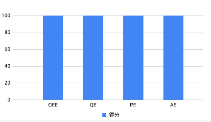
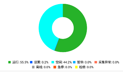
还有其它类型的图标,套路都是一样的,效果如下: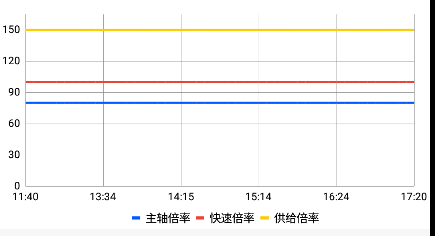
一番折腾之后,基本达到了想要的效果。现在既然会用了,后面要是再出Diy的效果,就得去动动源码了。这里咱先不动源码,先熟悉一下源码。
深入
先简单的看一下各种图表之间的关系,如下图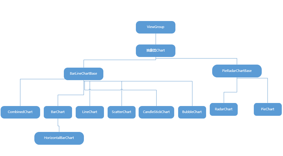
几个重要的类
1 | /** |
1 | public enum LegendForm { |
1 |
|
浅出
简单了看了一圈,可以看到图表本身就是一个ViewGroup,而在绘制不同图表时,通过重写onDraw()方法来实现,我们可以通过操纵属性,来坐一些简单的Diy。
欢迎大家,一起来探讨技术!!!